
Driven
Brand Identity
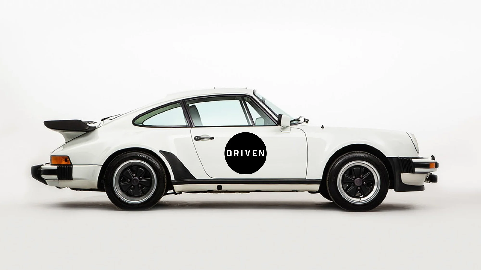
Driven is a heritage-rich automotive business entering a new era. Our goal was to build a brand system that honoured classic motoring culture while creating a clean, modern identity suited for digital-first audiences.
We built the identity around two core visual anchors:
The Wordmark: inspired by the bold geometry of road markings and race typography
The Roundel: a distilled symbol referencing classic racing livery, steering wheels, tyres, and dashboard dials

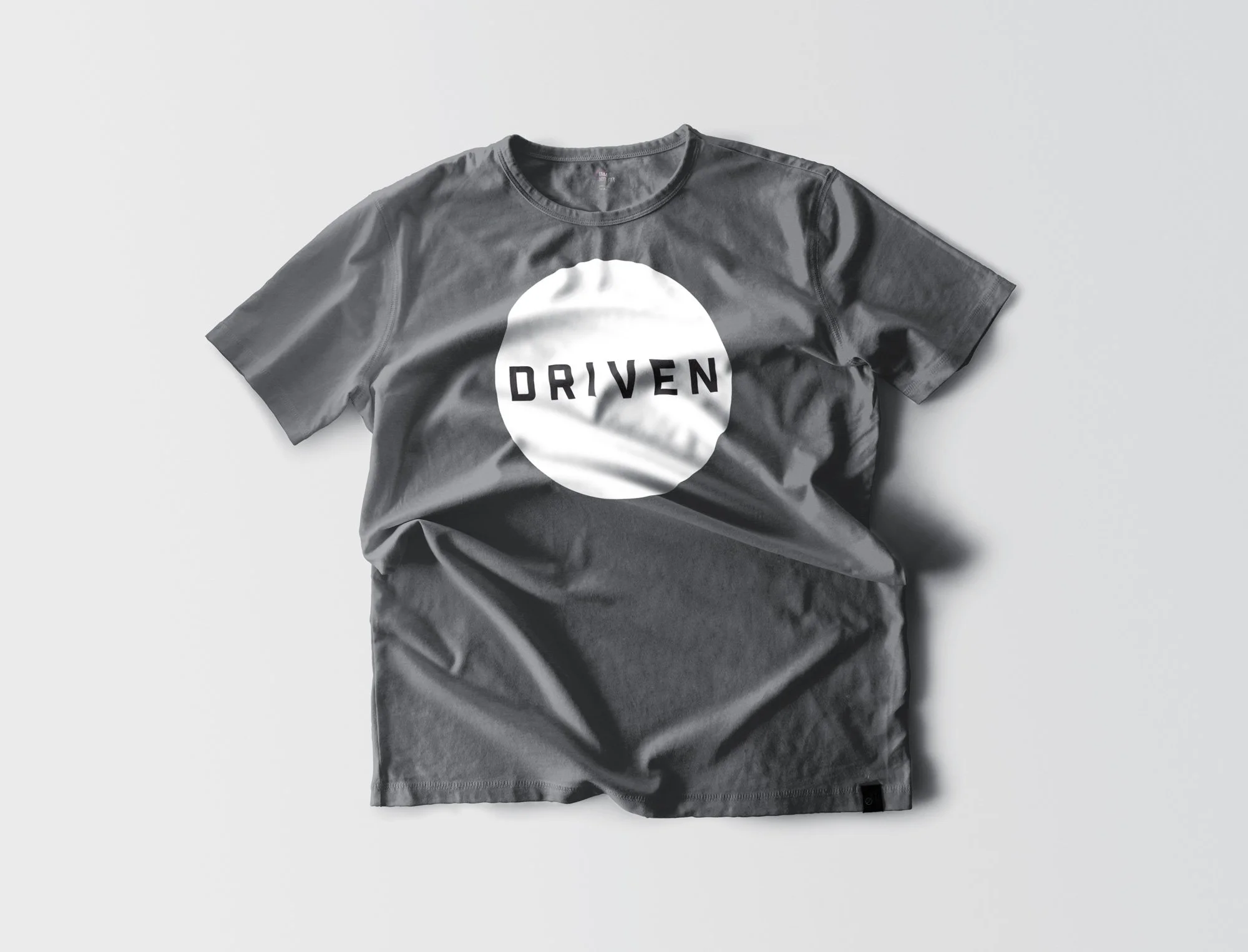
The result is a versatile, scalable identity that feels timeless, confident, and unmistakably automotive. It translates seamlessly across apparel, signage, digital platforms, and vehicle liveries.
This project demonstrates our approach to strategic brand engineering for complex, heritage-driven sectors.
Client
Driven Cars & Classics
Sector
Automotive Heritage & Retail
Disciplines
Brand Identity
Brand Experience
Environmental Design
Office
Cape Town
Project Team
Jason Bronkhorst
Traffic Bureau Strike Team